When dealing with multi-dimensional data, we could analyze each characteristic separately. However, this would not give us an overview of the whole dataset, but merely tell us about each of the details. If we want an overview, then we need to summarize the multiple dimensions down into something that we can illustrate as a graph.
This summarization process is part of multivariate data analysis, sometimes also called pattern analysis. There are many mathematical techniques for doing this, because there are many ways of summarizing anything, data included. In particular, the result of each summary may be unique, because there may be many possible patterns in the data that could be included in a summary, and each analysis technique may pick a different part of the data to summarize. After all, a summary must lose information, by definition, and there can be different opinions about which bits not to lose — each analysis technique can be seen as having its own "opinion".
I will be illustrating two different types of multivariate data analysis, using examples of data from the wine world. In this post I will look at ordination analyses, and in the next post I will look at network analyses (see Summarizing multi-dimensional wine data as graphs, Part 2: networks).
Ordinations
Ordination analyses try to put the objects in some sort of rank order (hence the name), which can then be displayed as a one or two-dimensional graph. In the graph, each point represents an object, and their positions relative to each other illustrate their similarity based on the original multi-dimensional characteristics. That is, the many original dimensions are reduced to one or two dimensions, and we then get a picture of the result. Points close together in the picture are more similar than are points further apart.
The specific example shown here is taken from this research paper:
María-Pilar Sáenz-Navajas, Eva Campo, Angela Sutan, Jordi Ballester, Dominique Valentin (2013) Perception of wine quality according to extrinsic cues: the case of Burgundy wine consumers. Food Quality and Preference 27: 44-53.As part of their work, these authors showed 23 wine bottles to each of 48 people, and asked them to subjectively assess what they thought was the likely quality of the wines (ie. based solely on looking at the bottle and its label). Their responses were categorized as Low quality, Average quality, or High quality.
In this example, there are 23 objects (the wines), and the characteristics are the three quality outcomes. For each object, we have a count of how many people placed it in each of the three quality classes (ie. we have three dimensions).
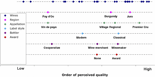
We wish to summarize the three-dimensional data down to one dimension, showing us the order of assessed quality of the wines, averaged across the 48 people. The authors chose to produce this summary with an ordination technique called Correspondence Analysis, which is certainly appropriate for their data. The resulting order of the wines is shown at the top of the first graph, with each dot representing a single wine, ordered along the dotted line from lowest quality at the left to highest quality at the right.
This is all very well, as we now have the wines in order, but obviously this isn't all that we want to know — we want to know what features of the wine labels led the participants to put the wine bottles in this particular order. This is easy to do for ordinations, and it is shown in the bottom five rows of the graph. Each row represents a different feature of the bottle labels, as indicated in the legend. The location of the colored dots within each row represents the average position along the dotted line of the wines with that feature.
For example, the second row indicates that the wines from the Pay d'Oc region are mostly down the left-hand (low quality) end of the graph, while the Burgundy and Jura wines are preferentially at the right (assessed as likely to be of high quality). Similarly, the fifth row indicates that wines bottled by a co-operative are preferentially at the low-quality end of the order, while wines bottled by the winemaker are at the high-quality end.
We can thus see at a glance which label features are associated with the decision that a wine might be of high quality, as assessed by the participants. This is what ordinations are all about — producing a picture of data once it has been arranged in some relevant order.
Ordinations seem to be rarely used in wine research, but I think that a case can be made that they should be used more often, as a very convenient way of summarizing complex data.


No comments:
Post a Comment