While contemplating the meaning of the numerical scores handed out by wine critics (What's in a number? Part the second), Alex Hunt produced various graphs showing the frequency distribution (see Wikipedia for an explanation) of the marks awarded by a selection of those critics. This selection included Jancis Robinson, Robert Parker and James Halliday.
For these people, Hunt pointed out various features that make each graph unique — this reflects the fact that these critics all use the wine scores in individual ways. This is an important point, because it seems to be widely thought that "a wine score is a wine score"; but this is not so. Each critic has their own individual way of interpreting, and thus using, wine scores.
Frequency distributions
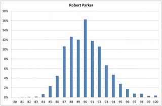
To do his analysis for each person, Hunt downloaded (from various websites) a collection of the scores they had assigned to the wines they had evaluated, on whatever points-scale system they had used (usually the 20-point or 100-point scale). From this, he constructed a set of graphs showing how often each person had awarded each score. As an example, this first graph is the one he constructed for Robert Parker, based on "43,094 scores from the online edition of The Wine Advocate, spanning the last four years." The height of each vertical bar in the graph represents the proportion of wines receiving the score indicated.
Hunt's stated purpose was to show:
that distributions are wholly personal, and can vary quite considerably between individuals who, on the face of it, use the same scoring system. There will [also] be evidence of ... the idea of 'significant scores' — that some numbers have more salience attached to them, and harbour an unexpectedly large number of wines within their boundaries, at the expense of their immediate neighbours.So, Hunt is suggesting that wine assessors often have subconscious biases about what scores to assign, and that their particular biases become obvious when you plot a frequency distribution of lots and lots of their wine scores. It is this point that is of interest in my blog post — that some critics show individual biases in the scores that they award.
For the Parker graph, Hunt notes two biases:
A significant spike appears at 90, and 89 is unusually low — contrary to expectation, lower than 88. Could it be that a certain proportion of wines are just tickled over the finish line into the most salient category of wine scores in the world: 90+ RP? [wines with scores of 90 Parker points or more] ... The effect is repeated for that other super-salient category: 100 RP ... here, we see a dip at 99, then a marked increase at 100. Should we conclude that there are more perfect than nearly perfect wines? No; just that the category of 100-pointers has been allowed to swell rather.That is, some of the "90" scores should actually have been 89, in an unbiased world, and that some of the "100" scores should actually have been 99. It would be interesting to estimate just how many scores are involved, as this would quantify the magnitude of these two biases.
Estimating the biases
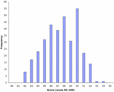
However, I do not have the Parker data available, and so I will illustrate this point with a different dataset. This dataset concerns 335 Sicilian wines reviewed in the article Sicily's Star Rises, by Alison Napjus in the Wine Spectator magazine. These wines were scored on the 100-point scale; and the frequency distribution of those scores is shown in the next graph.
For these data, the "expectation" that Hunt refers to (in the quote above) is that, in an unbiased world, the point scores would show a relatively smooth frequency distribution, rather than having dips and spikes in the frequency at certain score values (such as 90 or 100). In the data for the Sicilian wines, it seems that there are two unexpected spikes or dips: (i) a score of 87 is less frequent than a score of 86; and (ii) a score of 90 is more frequent than a score of 89. These both contradict the expectation of a smooth distribution.
Thus, it seems that the scorer(s) preferred even-numbered scores to odd-numbered scores. This idea can be investigated by working out what the "expected" values would be, in an unbiased world.
Mathematically, the expected scores would come from an "expected frequency distribution", also known as a probability distribution (see Wikipedia). There are many such theoretical distributions that have been devised by mathematicians, for many different purposes. There is a simple model behind each of these distributions, and all we have to do is choose a model that seems appropriate for the type of data that we have — this then tells us which probability distribution to use.
It seems to me that a Weibull distribution (see Wikipedia) would be suitable for wine-score data (for both the 20-point and 100-point scales). One way to think about this distribution is that it models the maximum values of a series of observations that have an upper limit. What this means in our case is: (1) the assessors assign to each wine the highest score that they believe it deserves ("this wine deserves no more than an 89"); and (2) the scores are much closer to the upper limit of 100 than to the lower limit of 50. Both of these ideas seem reasonable.
We can fit this model to the data using standard mathematical techniques (involving the principle called maximum likelihood), which will then provide the expected frequency of each score. In order to work out the degree of bias in the observed scores of 89 and 90 (too many scores of 90 and not enough 89s), we then need to repeat this analysis, each time changing the observed frequencies of both 89 and 90.
For example, the Wine Spectator data have 31 wines with a score of 89 and 55 wines with a score of 90. So, we repeat the fitting of the Weibull distribution with 32 scores of 89 and 54 scores of 90, instead, and then do it again with 33 scores of 89 and 53 scores of 90, and so on. Eventually, we will find out which frequencies of 89 and 90 are optimal for our model; and these will be our estimates of what would happen in an unbiased world (the "expected" values).
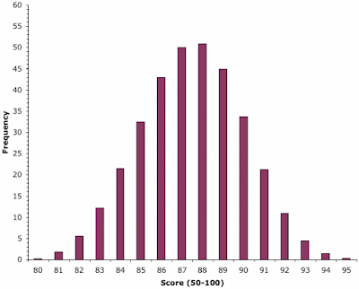
The resulting frequency distribution is shown in the graph immediately above. Note that it is a nice smooth distribution, with no dips or spikes.
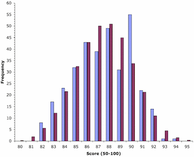
This expected distribution is compared directly with the observed distribution in the final graph. In this graph, the blue bars represent the (possibly biased) scores from the Wine Spectator, and the maroon bars are the unbiased expectations (from the model). Those scores where the heights of the paired bars differ greatly are the ones where bias is being suggested.
Note that this comparison shows expected frequencies for scores of 87, 89 and 90 that are very different from those produced by the Wine Spectator, implying that all three of these scores show bias. (As an aside, scores of 83 and 93 also seem to show a bit of bias.) So, the final result is that c. 18 of the scores of "90" would have been 89 in an unbiased world. That is, 32% of the scores of 90 show bias!
A score of 90 is, indeed, much more important for some wine assessors than is a score of 89, exactly as suggested by Alex Hunt (when studying Robert Parker's scores).
This same type of analysis could be applied to any other wine scorers. Indeed, if you were a mathematician you might also like to try other models, to see whether it makes much of a difference.
“. . . Readers often wonder what a 100-point score means, and the best answer is that it is pure emotion that makes me give a wine 100 instead of 96, 97, 98 or 99.”
ReplyDeleteSource: Robert Parker, The Wine Advocate (unknown issue from 2002)
From The Wall Street Journal “Weekend” Section
ReplyDelete(November 20, 2009, Page W6):
“A Hint of Hype, A Taste of Illusion;
They pour, sip and, with passion and snobbery, glorify or doom wines.
But studies say the wine-rating system is badly flawed.
How the experts fare against a coin toss.”
Link: http://online.wsj.com/article/SB10001424052748703683804574533840282653628.html
Essay by Leonard Mlodinow
(. . . teaches randomness at Caltech. His most recent book is
"The Drunkard's Walk: How Randomness Rules Our Lives.")